Advanced Thinking in Digital Storytelling
Remember that less is more!

When we introduce new technology tools to our students, the focus for the projects can stray away from content with the end products becoming technology demonstrations of flashy new features instead of compelling examples of what our students have learned. As we look to integrate digital storytelling in our classrooms, it is imperative that we maintain high expectations and apply rigorous standards to the production of digital stories. Our students must become savvy writers and designers, creating digital stories that take advantage of, rather than suffer from, the visually stunning effects today’s tools provide.
Advanced thinking in project work does not mean more technology. Creating superior digital stories lies more in meta-cognition than in manipulation. Most editing software comes equipped with a plethora of transitions, visual and audio effects, background music, and text styles. When turned loose with all these choices, students will often cram as many effects as possible into a three-minute story for no other reason than “I could” or “They look cool.”
Repeating the mantra “Less is more” helps my students improve the quality of their digital stories. We also focus on a strong narrative and a true understanding of how and why to use movement, transitions, and sounds.

The Writing Process
The foundation of a good digital story is a solid piece of writing that includes a point, dramatic question, and emotional content. In addition to these key elements, I have my students focus on verb choice, observations, and keeping their writing concise.
Precise verbs drive a story.
Action verbs provide a far richer meaning and appeal to the senses better than linking verbs. Looking at my cat Sunny next to me, I might write “The cat was relaxed,” but a better choice would be “The cat lounged on the couch.” Verbs with a definite meaning also help the viewer create a more accurate mental picture of the story. The word “walk” is not nearly as descriptive as “saunter,” “stroll,” “stagger,” “stomp,” or “strut.”
Effective writers must observe carefully.
When viewers observe our stories, they infer meaning. If we make these inferences for them, we cheat our audience. “He was mad,” tells the audience, but “His nostrils flared, his teeth clenched, and his eyes bulged” allows the viewer to draw their own inferences and become a more active participant in the story. Including sensory terms and descriptions allows the audience to create the picture in their minds.
Too much background dilutes a story.
Feeling like they need to set up an entire scene so they don’t confuse their audience, writers often add too much detail. However, a carefully written first sentence can take us right into the story. The viewer will figure out what is happening based on their own experiences.
I had one student who wrote about an incident at a dance camp she attended. Her story initially started with an entire paragraph explaining location, how she got there, when she went, and so on; she transformed the beginning into, “My legs tensed as I waited for my cue; after all the sweat at camp, it was Showtime.” The tone, point, and dramatic question are clearly established: she is a dancer, at a camp, and has prepared for this moment intensely. Now she can tell her story.
Making the Movie
Movement (panning and zooming) can add a dynamic feel to still shots and can aid in developing plot, revealing character, or creating a dramatic effect. When working with my students, I encourage the judicious use of movement. When they grumble about not using video, I share footage from Ken Burns’ documentaries to help explain that brilliant manipulation and stunning effects can be made using still images.
Students need to learn the impact of each movement before they can effectively create interplay between movement and narration.
Slow zoom out gives an object a sense of place or setting. It also gradually reveals information that can be intriguing to the viewer.
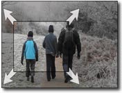
Slow zoom in focuses the viewer and draws attention to a particular object or person. Carefully coordinating the zoom with narration is critical.

Quick zoom in gently focuses the viewer and draws attention to a particular object or person. Carefully coordinating the zoom with narration is critical.
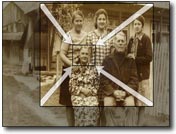
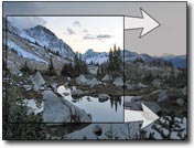
Panning creates an illusion of a storyboard, slowly revealing information as it coincides with the narration. Since our eyes have been trained to move left to right from years of reading, this direction is the most natural feeling and easiest to follow. Right to left panning feels unnatural and can be used to create an uncomfortable effect for the viewer.
The Characteristics and Composition of Comics
The variety of movement is endless and I always ask students to reflect on the purpose for each movement. When students initially start using this effect, movement is typically too fast. It takes a lot of practice to understand that subtle and slow is the way to go. Having students include movement information on their storyboard helps remind them to consider movement as an element of effective design.
Transitions can be a real trap. We have all seen way too many PowerPoint presentations that use a different transition for each slide. Although most transitions are distracting, transitions can be used to help tell a compelling story.
To help students understand the purpose of transitions, I tell them to think of them as punctuation marks:
- A cut (or no transition) is like no punctuation, or at most, a comma.
- A dissolve (or a cross fade) is like a period.
- A fade to black is closest to an "enter" or a new paragraph, suggesting a change in thought or time passing—the longer the black, the longer the ellipsis.
On occasion, more complex transitions can be effective. One of my students used used descending vertical bars to transition to an image of someone ending up in a jail cell. The student had a compelling reason for using this transition and was acutely aware of the additional meaning it conveyed.
Sound
A carefully chosen soundtrack can have a dramatic impact on the entire story. Pacing, emotion, point, and dramatic question are all enhanced with appropriate music. Imagine “Jaws” without its signature du-dum soundtrack. Conversely, a poorly chosen soundtrack can be distracting and confusing.
Proper instrumental music can also set tone, add to pacing, and augment and bolster the emotional content of a piece. Music, however, can also be a distraction. One of my students developed a digital story about her experience being abducted at age 13. She chose to use no soundtrack because the stark reality of the situation was better matched to the haunting sound of her voice and the cruel silence between her lines.
Joe Lambert, of the Center for Digital Storytelling (www.storycenter.org), points out that “the gift of your voice” personalizes the story. Voice, especially in a retrospective tone (like that of Richard Dreyfuss in the film “Stand By Me”), can add depth and texture to a piece.
As students make decisions about sound in their stories and explore voice over, sound track, and sound effect options, I suggest they:
- Avoid redundancy: As students build their movies and revisit their narratives, they should eliminate words whose meaning is already conveyed with an image. In other words, there is no need to describe the color of the ocean if the picture is there.
- Pacing: Most of the time, student stories do not allow viewers enough time to process images. Nothing adds more to meaning than to start the voiceover at least one full second after the image appears.
- Sound track: Any sound tracks should include instrumentals only. Lyrics distract from the narration, which is the real heart of the story. It is also not essential to have music throughout the story. A break in music can add drama to a piece, especially at a turning point.
Compelling Story, Thrilling Process
True digital storytelling is a writing experience bolstered by images and sound. What’s most important is that story takes the lead. If we focus more on good writing and the essence of sharing the story, technology very naturally becomes the tool and not the focus. When images, voice, and sound are effectively added to a strong story, the result can be truly remarkable.
While it is impractical to require students to become expert filmmakers, focusing on a strong story and employing subtle manipulations can greatly enhance their final digital stories, improving both the end product and the learning process.


